
Who we are
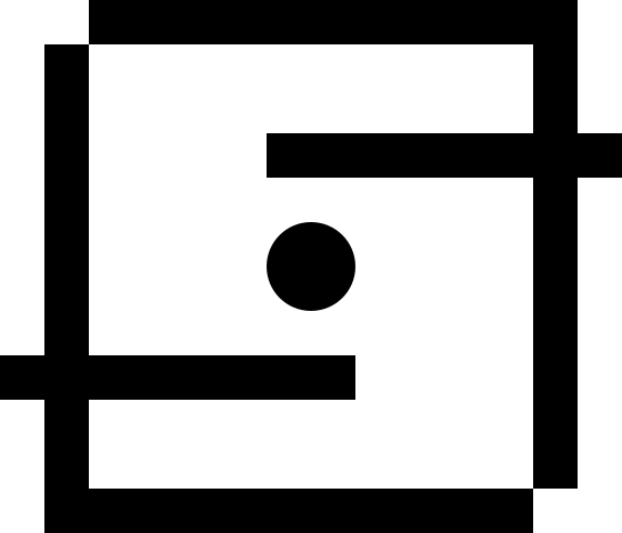

Logo
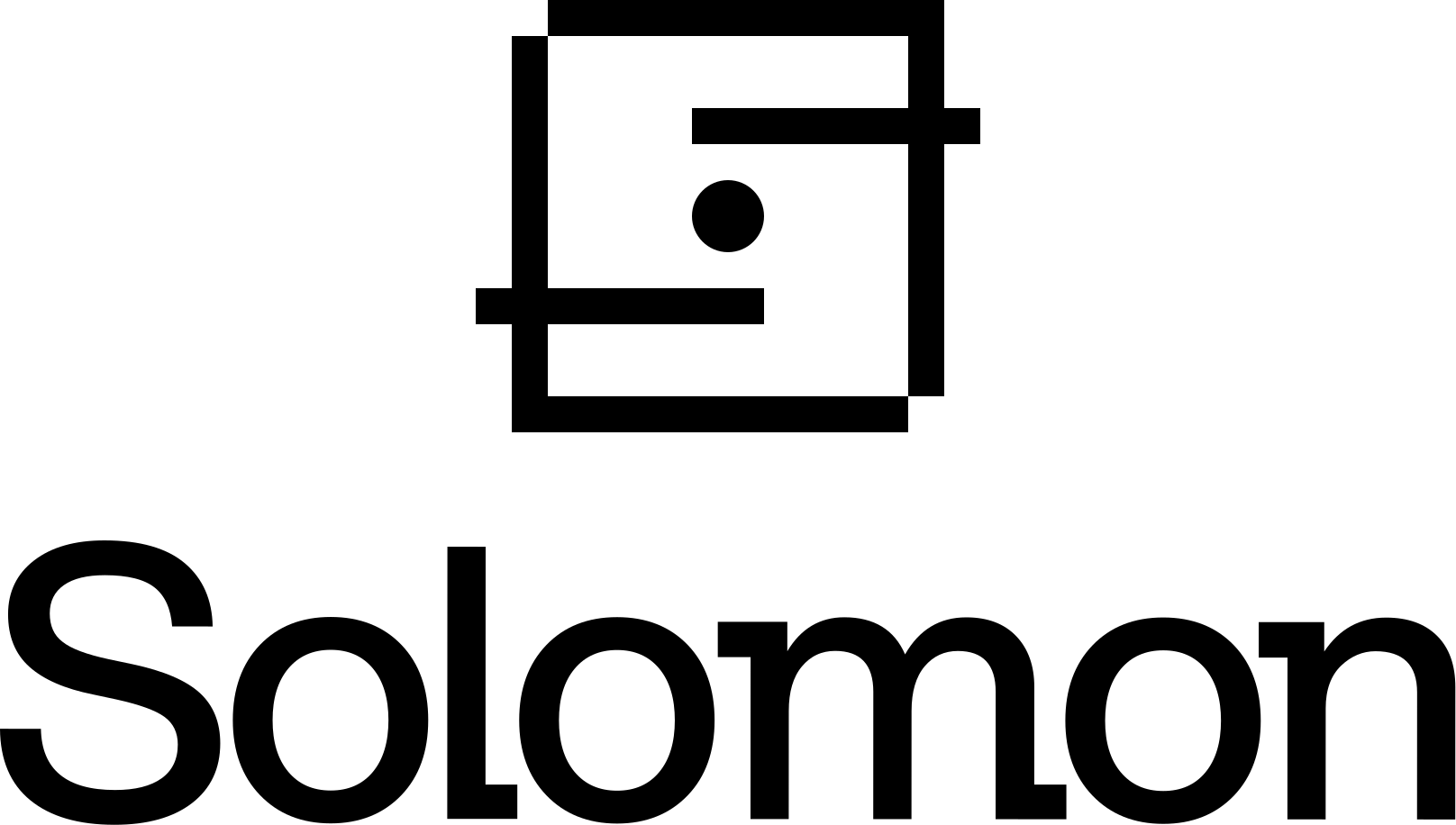
Vertical Logo
Logomark
Wordmark
Use these guides to ensure our logo is always positioned correctly.
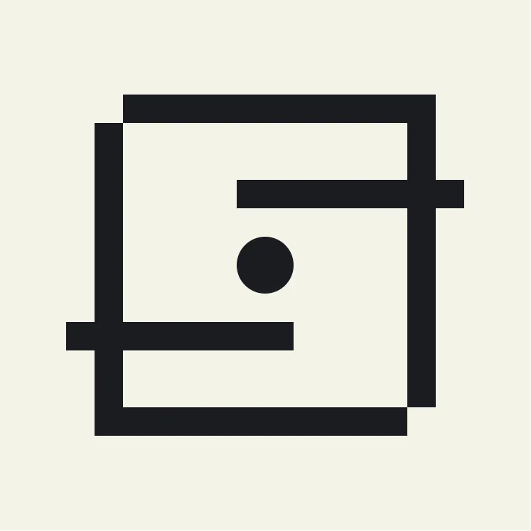
Square
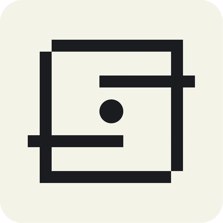
Rounded square
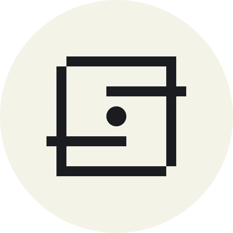
Circle
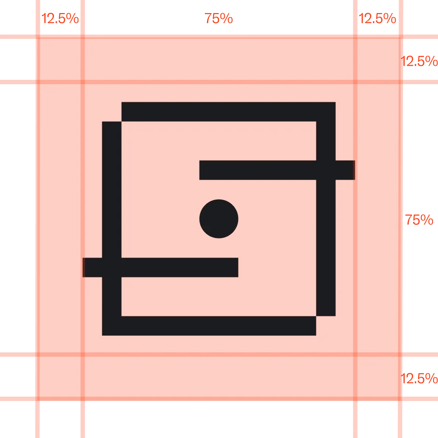
Square measurements
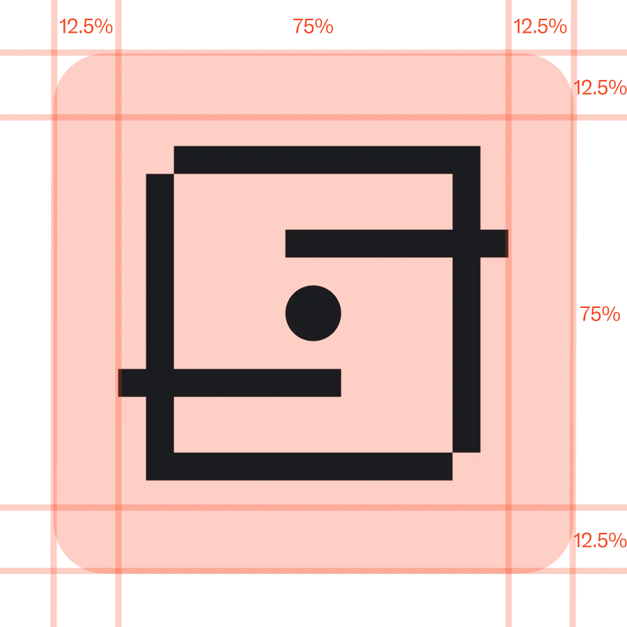
Rounded square measurements
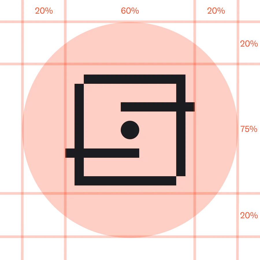
Circle measurements
The shortest each mark can be rendered while remaining legible.

Logo minimum height: 25px / 6mm
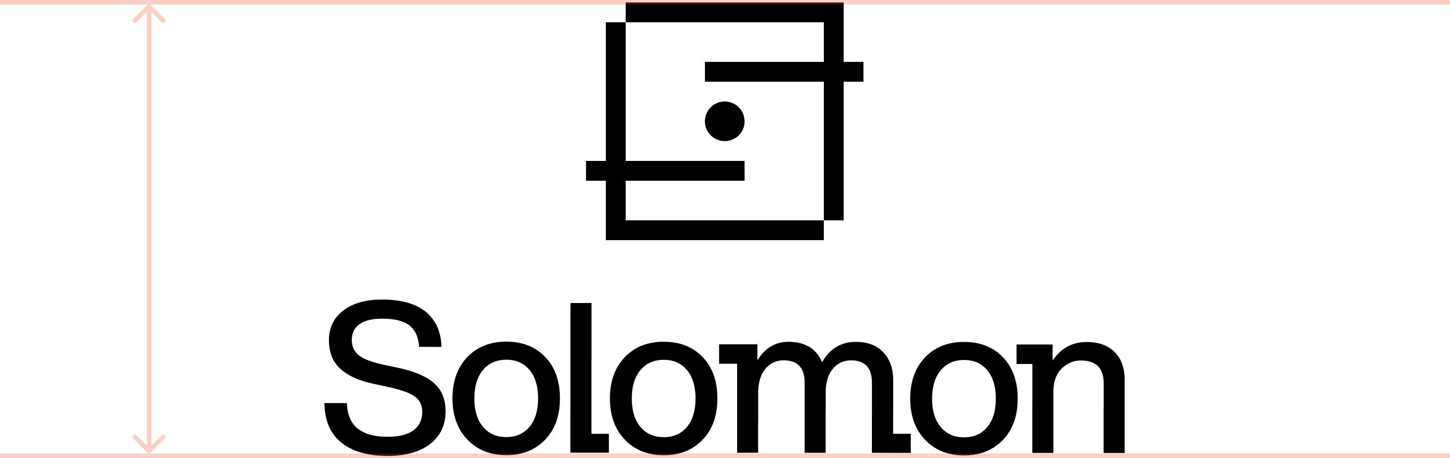
Vertical logo minimum height: 45px / 7mm
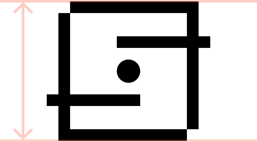
Logomark: 20px / 5mm

Wordmark: 20px / 4mm
Minimum spacing around logos to make sure there's enough space.
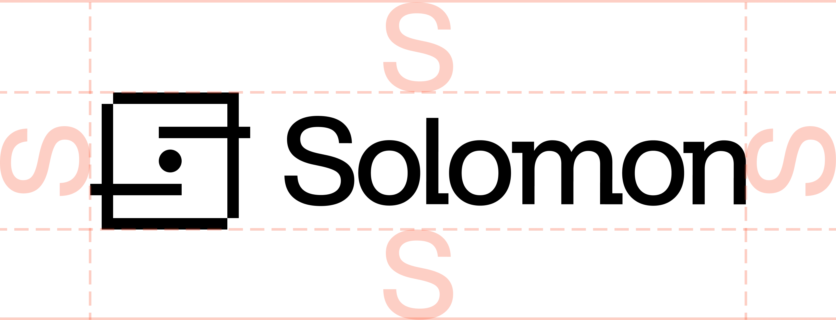
Logo: one 'S' padding
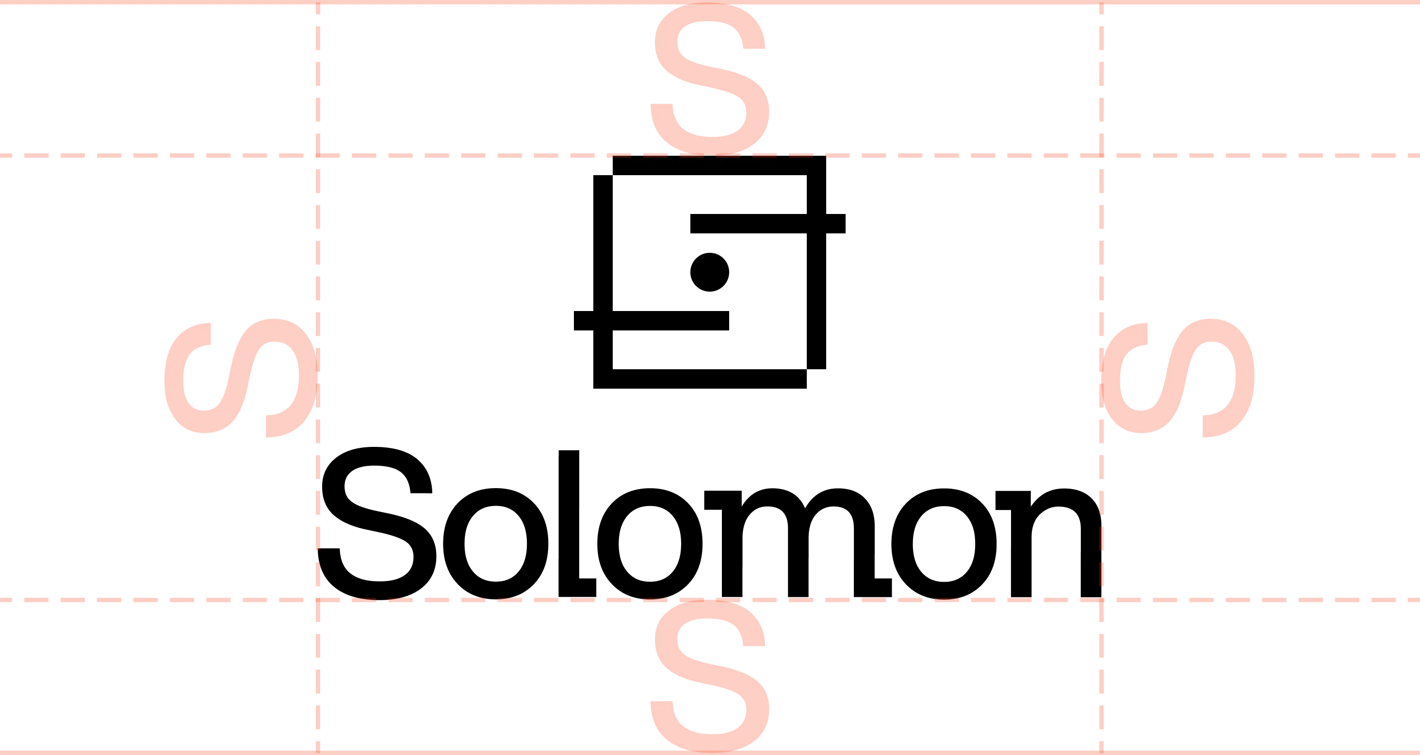
Vertical logo: one 'S' padding
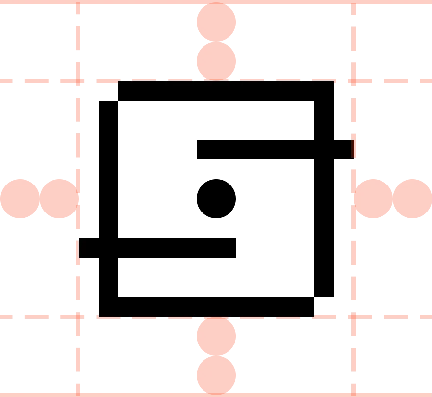
Logomark: two units padding
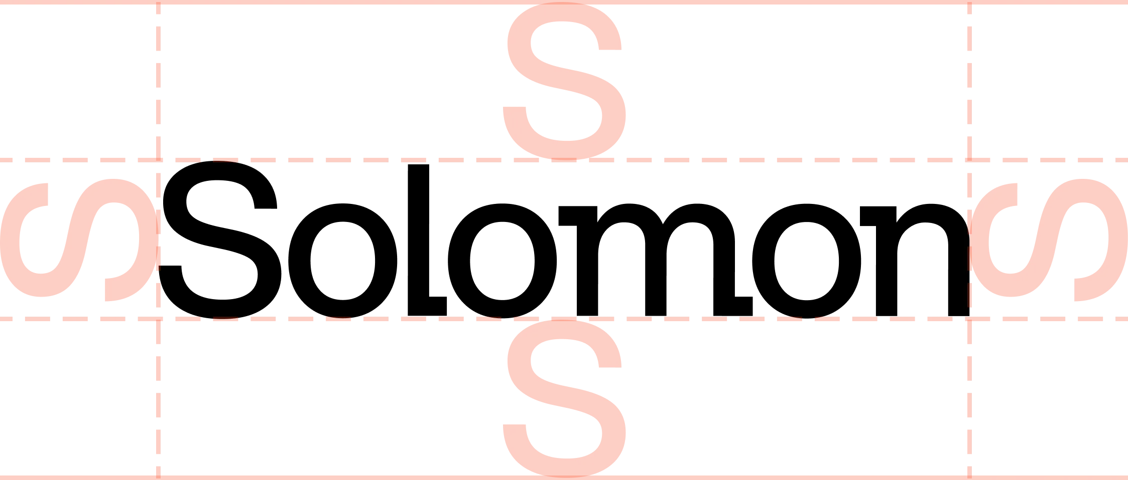
Wordmark: one 'S' padding
How to present our logos in conjunction with other logos.

Horizontal partnership

Match optical weight, align to baseline, one 'S' separation

Vertical partnership

Match optical weight, align to vertical center. One 'S' separation from each logo
Square
Rounded square
Circle
Square measurements
Rounded square measurements
Circle measurements
The tokens
The USDv and SOLO token marks.
USDv
SOLO
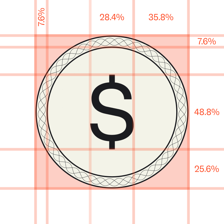
USDv measurements
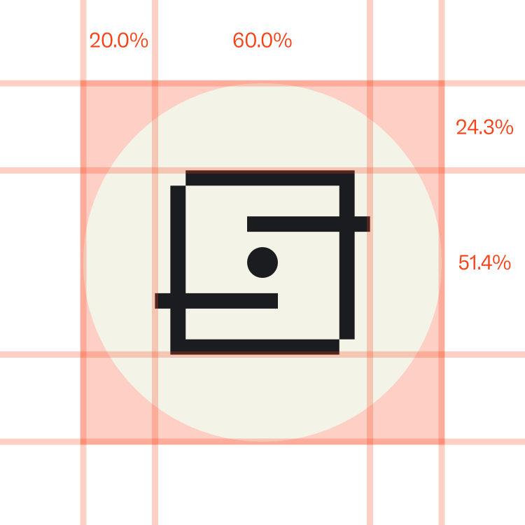
SOLO measurements
The shortest each mark can be rendered while remaining legible.
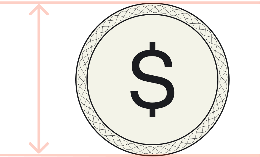
USDv Logomark: 20px / 5mm
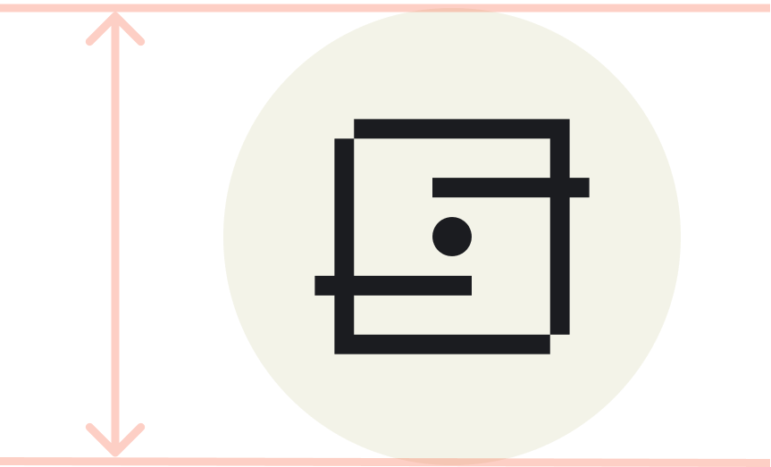
SOLO Logomark: 20px / 5mm
USDv
SOLO
USDv measurements
SOLO measurements
USDv Logomark Usage
Expression through real materials
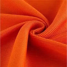
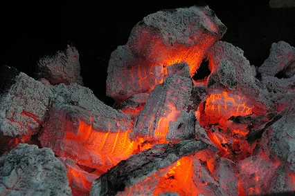
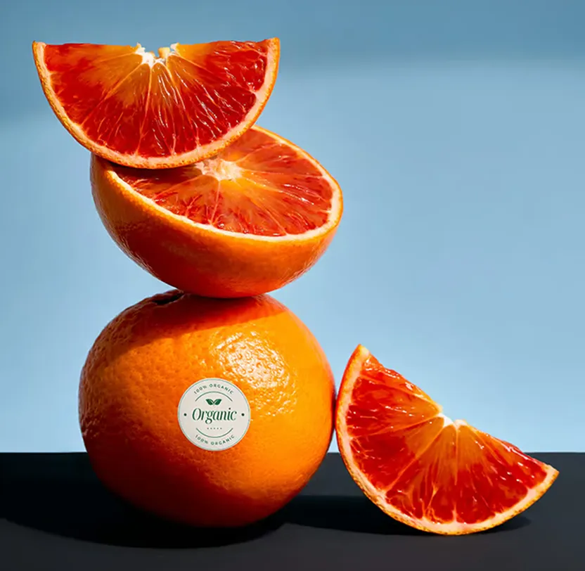

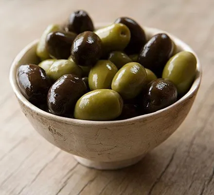
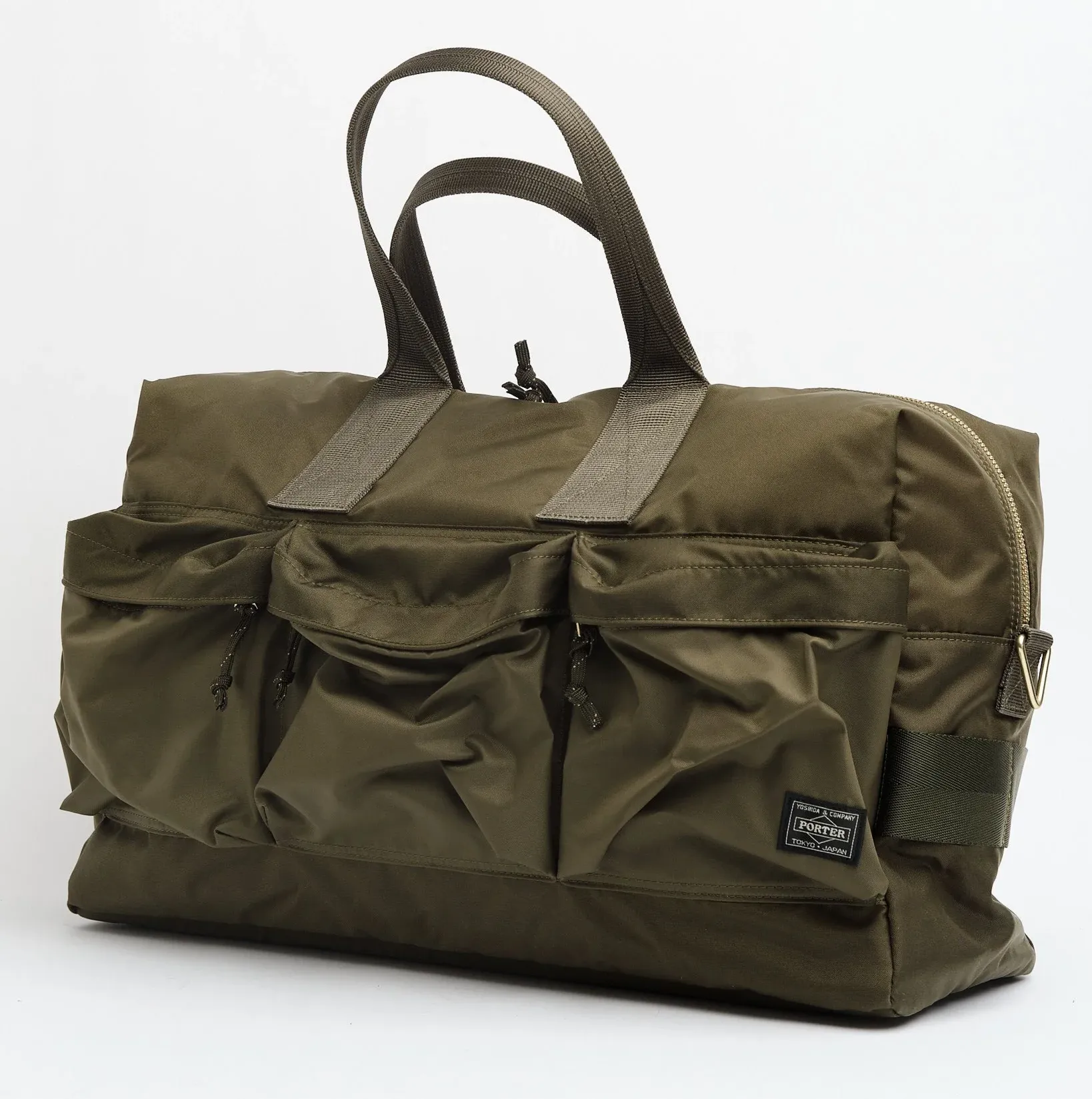
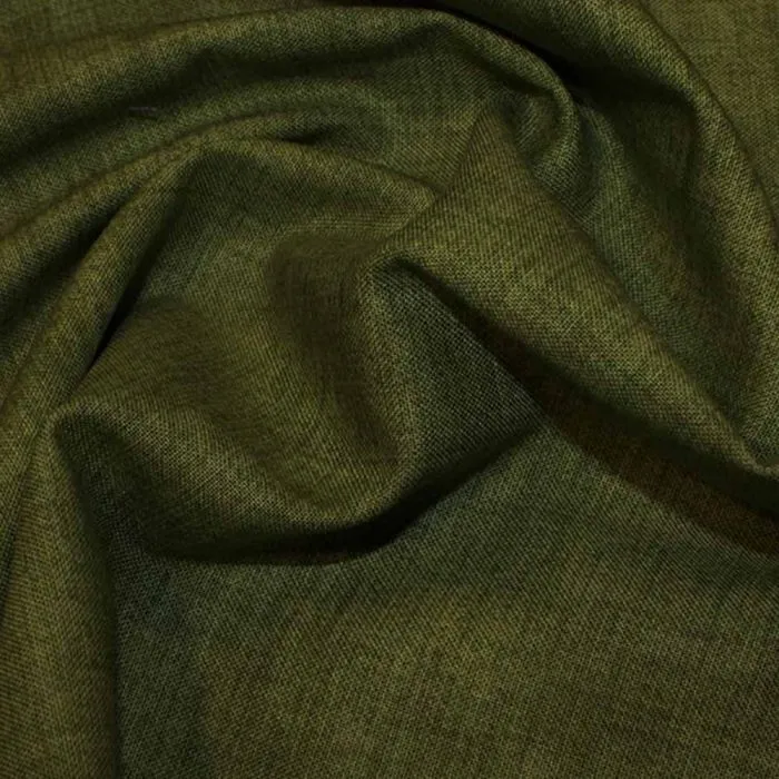


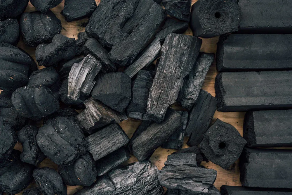
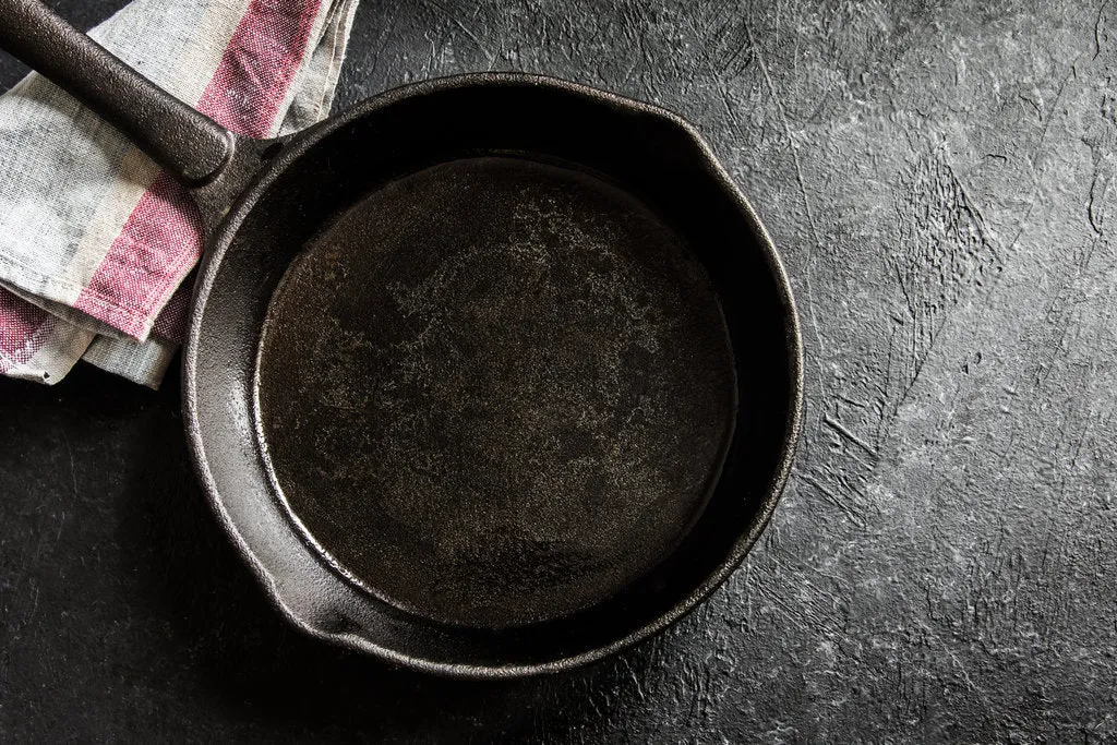

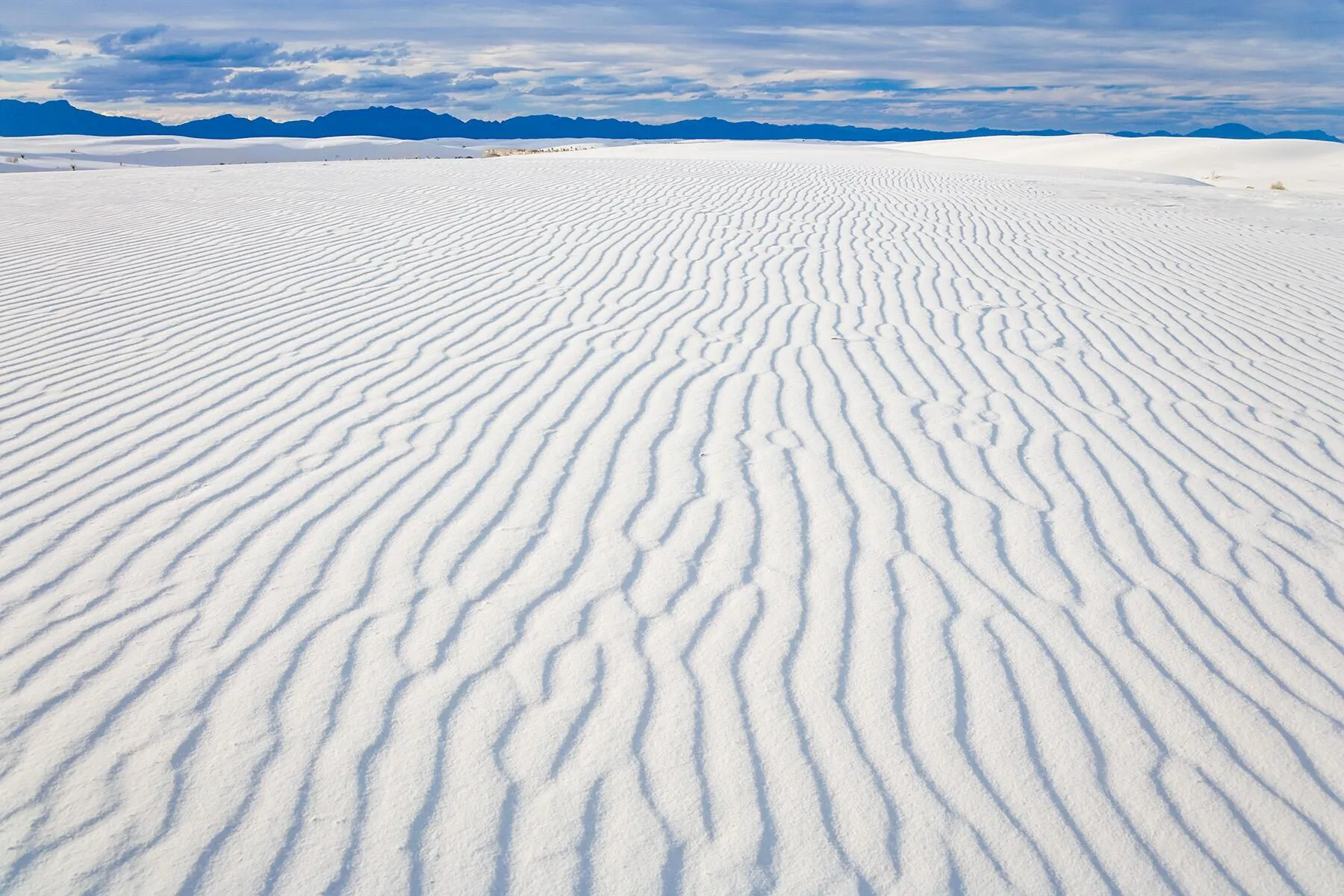




Recommended Color Compositions
Charcoal on Paper
Olive on Paper
Ember on Paper
Charcoal / Ember on Paper
Olive / Ember on Paper
Paper on Charcoal
Ember on Charcoal
Paper / Ember on Charcoal
Paper on Ember
Charcoal on Ember
Paper on Olive
Ember on Olive
Ember / Paper on Olive
Every typeface has its role
Rhymes Display
Display & Headlines
AaBbCcDdEeFfGgHhIi
JjKkLlMmNnOoPpQq
RrSsTtUuVvWwXxYyZz
0123456789
. , % $ + – : / ! ? & @
Weight: 200
Styles: Normal
Leading: 0.95×
ABC Social
Body, UI, all running text
AaBbCcDdEeFfGgHhIi
JjKkLlMmNnOoPpQq
RrSsTtUuVvWwXxYyZz
0123456789
. , % $ + – : / ! ? & @
Weight: 300, 350, 700
Styles: Normal, Italic
Leading: 1.25×
APK Narrative
Numbers, data, metadata
AaBbCcDdEeFfGgHhIi
JjKkLlMmNnOoPpQq
RrSsTtUuVvWwXxYyZz
0123456789
. , % $ + – : / ! ? & @
Weight: 300
Styles: Normal
Leading: 1.25×
Brand in Use
Logo: Charcoal on Paper
Logo: Paper on Charcoal
Logomark: Charcoal on Ember
Logomark: Paper on Olive
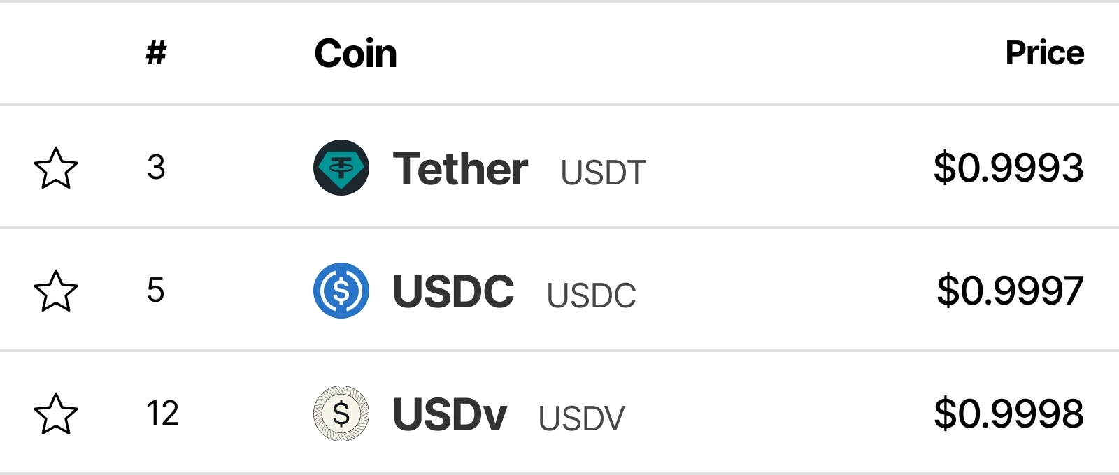
Token Logomark: Data Platform
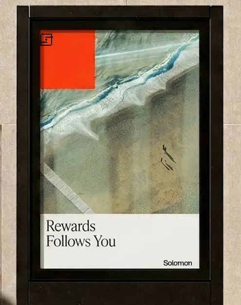
Print: Advertising
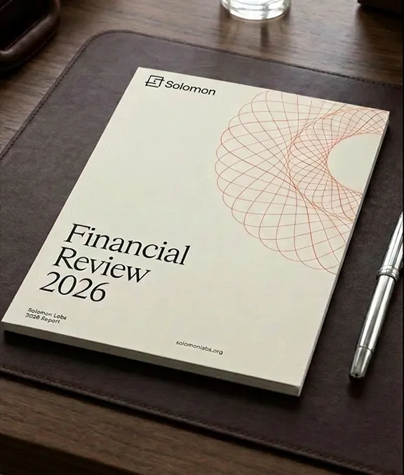
Print: Financial Report
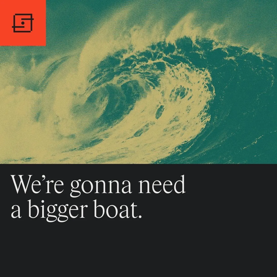
Social: X Post
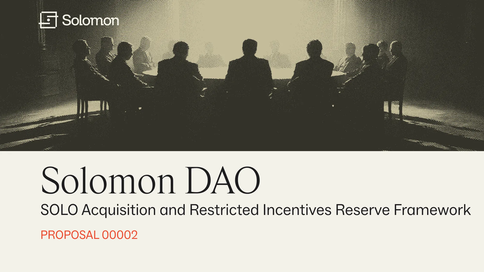
Social: Governance Post
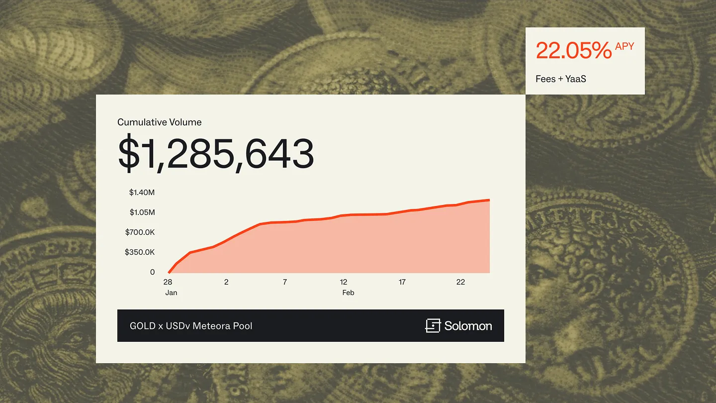
Content: Infographic
Social: Banner
Content: Blog Post
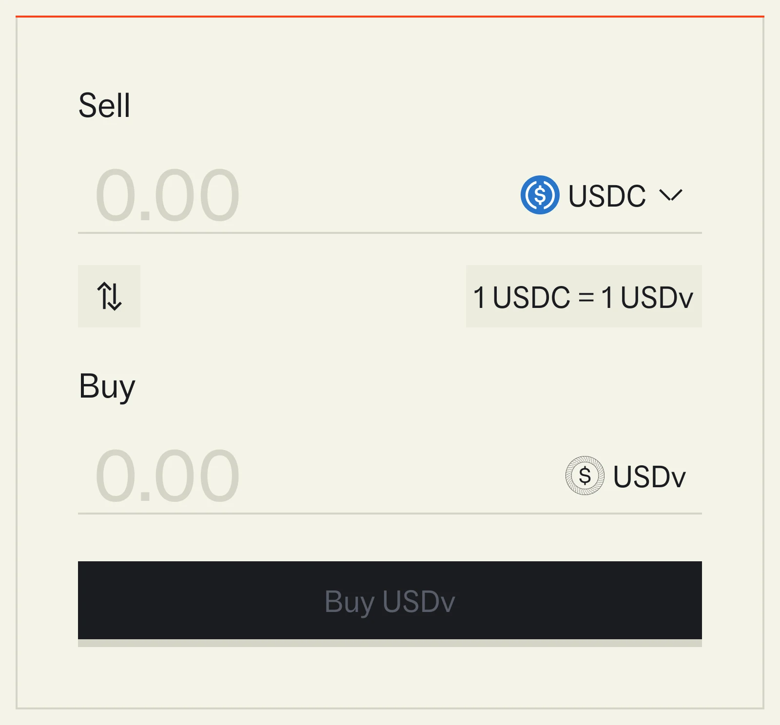
Token Logomark: Product